Tuesday, April 10, 2012
Visual Rhetoric Slide Presentation
We are doing a prezzie presentation (a type of interactive power point). So we will be analyzing the visual rhetoric slide presentation. One important choice that needs to be made is font choice. Depending on the mood of the image/slide an acceptable font needs to be chosen. Generally people need to choose more serious fonts unless their power point is less serious in nature. Typically the "type of text dictates font choice". This means you should add emphasis and tone with the font. Readers need to be able to read the font as well, so an acceptable font size should be chosen. Another important issue is whether readers can read the font. This can be broken into font readability and contrast. Contrast is important when choosing colors of text and background. Some colors do not overlay well and should be avoided. Typically the font should be darker (not this) than the background, and a neutral bridge should be used.
These topics are important when dealing with the overall issue of design clarity. The power point should be easy to follow, and free of complicating or unnecessary design elements such as clutter, or excess color. On the other hand the presentation should be eye catching and readable. Typically a slide needs to be organized in a left to right direction so it "flows" well to an audience. Even if the report is original and striking it needs to be consistent. Each slide should be different, but there should not be any massive leaps in style or organization. As a whole the presentation should be very easy to follow and read, and finding the balance between this and keeping it intriguing is the ultimate goal. (281 words)
By: Arjun, Jason, Peter, and Alex
Anna Thyen, Natalie Weiss, Preston Quam, Nanxi Yan
For our project, we decided to do a PowerPoint interactive presentation for our picture essay. On the OWL website we found the Visual Rhetoric: Use of Images to be very helpful when bringing our PowerPoint together. Our main task in this project is to take clear and focused pictures to show incoming freshman around campus. The OWL talks about an important point of making sure the pictures are clear and everything can be seen well. This website also talks about how many beginning designers tend to take pictures from the internet instead of their own. When copying internet pictures, there may be a result in unclear visual effects. We plan to take as many of our own pictures as possible to stray away from this problem. Clutter is another main problem that may arise when pictures are used. The OWL shows how some pictures may be seen better when they are manipulated to focus on what the composer wants. We plan to cut and crop our pictures to have the least amount of clutter possible. Along with the pictures, a main part of our PowerPoint presentation is the map explaining where everything was taken. The OWL talks about many different kinds of graphs, by showing that if these graphs are not relevant to your project then they should not be used. The website also explains how there are different types of graphs for many different types of information. For example we wouldn't want to use a pie chart or something like that for a map of Purdue. We plan to make the map as clear as possible, so it clearly can help incoming freshman get where they want and need to be.
For our project, we decided to do a PowerPoint interactive presentation for our picture essay. On the OWL website we found the Visual Rhetoric: Use of Images to be very helpful when bringing our PowerPoint together. Our main task in this project is to take clear and focused pictures to show incoming freshman around campus. The OWL talks about an important point of making sure the pictures are clear and everything can be seen well. This website also talks about how many beginning designers tend to take pictures from the internet instead of their own. When copying internet pictures, there may be a result in unclear visual effects. We plan to take as many of our own pictures as possible to stray away from this problem. Clutter is another main problem that may arise when pictures are used. The OWL shows how some pictures may be seen better when they are manipulated to focus on what the composer wants. We plan to cut and crop our pictures to have the least amount of clutter possible. Along with the pictures, a main part of our PowerPoint presentation is the map explaining where everything was taken. The OWL talks about many different kinds of graphs, by showing that if these graphs are not relevant to your project then they should not be used. The website also explains how there are different types of graphs for many different types of information. For example we wouldn't want to use a pie chart or something like that for a map of Purdue. We plan to make the map as clear as possible, so it clearly can help incoming freshman get where they want and need to be.
Visual Rhetoric Nate, Marissa, Alex, Danielle
In our project we will have to use a good choice of text and color overlaying our video to give the audience more information on who we are interviewing. Also when we will be taping our interviews we will be making sure to keep the back round out of the focus so it is not a distraction to the audience. Our text will have to be not to flashy so it doesn't distract the audiences attention to it but something they can just read and be done with. Also we will need to use a good color choice for our text so that it doesn't blend in with our video and also so its doesn't pop out too much. So our group will primarily use the text and color page on owl to help us on our project.
Project Blog
Alex Azeez
Chinyelu Asher
Bennett Oliver
Mike Gaglianese
We looked at the visual rhetoric page of owl and found a few things to help us with our project. One thing we looked at is the PowerPoint called designing an effective PowerPoint. This slide show we learned that we can make our powerpoint better by using certain transitions and animations. We can also improve our slide show by considering the arrangement and text on each slide.
Another slide show we looked at that will help improve our project is about color theory. In this slide show we learned about primary and secondary colors and colors that are aesthetically pleasing. Because we are using pictures from around campus we must strategically pick the colors in our powerpoint to make them coordinate with our pictures. The contrast and analogus color slides showed us how to go about this correctly.
Visual Rhetoric
Christian Doug Ben Kyle
In our project we are going to use a lot of photographs, some illustatrations and diagrams. The visual rhetoric: use of images page will help our group a lot because it will give us tips and information about how to use the specific images to help make our project better. We will also look at the color page because it will give us information to make our project more lively and we will look at the text element page because it will help us use certain fonts.
In our project we are going to use a lot of photographs, some illustatrations and diagrams. The visual rhetoric: use of images page will help our group a lot because it will give us tips and information about how to use the specific images to help make our project better. We will also look at the color page because it will give us information to make our project more lively and we will look at the text element page because it will help us use certain fonts.
Tuesday, April 3, 2012

The ad that I chose to analyze is for a Power Bar. This ad has an ultimate goal of making the viewer want to buy it simply because it would make them a more fit and determined person. First the ad shows the shadow of the lady, without the Power Bar in her system, hunched over tired because she doesn't have enough energy to keep going. The actual image of the lady is showing her stronger than ever and running fast. The fact that the ad has her weaker self as just a shadow shows that she has left this part of herself behind. By eating the Power Bar she has become a new and improved woman who can run without getting tired. The viewer of this ad is supposed to see the power bar as the reason for her persevering though the tough times in a workout. Second the ad uses a woman that seems very fit and attractive. By using someone that is easy to strive to become, the product is seen as working even more. The view can see the muscles in the lady's legs and the drive in her stride. The viewer may infer that this is all because she had a Power Bar before she started running. The words in the bottom right corner or the add "Increase Your Performance" are there just to reassure the viewer that the reason she can run farther than she ever could before is because she had this Power Bar. A very important final detail included in this ad is the Power Bar itself. The viewer now has a visual image of what the bar looks like so it will be easy to find at the store.
Advertisement Communication

The advertisement that I chose to analyze was this ad by Pepsi. In this add Pepsi is communicating in several different ways to achieve their overall goal to convince people to buy pepsi. First off, this add places two cans side by side, with the can on the left without a logo. This shows that clearly that Pepsi is trying to make a point against the other brand. Most people know that Coke and Pepsi have had a rivalry for a long time, however in this ad pepsi puts no name on the Coke can to show that Coke is inferior to Pepsi, and it practically a cheap generic brand. The ad also features two straws with the cans. The straw in the Pepsi can is fully submerged and enjoying its beverage, however, the straw associated with the coke can is attempting to stop itself from "drinking" the Coke. This is Pepsi further communicating that Pepsi is the superior brand and that no one should even want to drink coke, not even a straw. The communication from the Pepsi company is loud and clear in the advertisement even though there are no words associated with it. However, the lack of words takes nothing away from the ad, it already screams "Coke sucks! Buy Pepsi!"
Monday, April 2, 2012
Visual Rhetoric
http://wikilanguage.pbworks.com/f/1252792581/7118_1208704864954_1448684460_30615625_448365_n.jpg
It is trying to convey that we need to stop smoking because it kills so many people per year. Actually even saying that it kills a person every 8 seconds. The picture itself evokes fear because it is set up to look like the World Trade Centers which is a major event that everyone remembers that a lot of epople died at. The picture gets you to think of a time when so much death was out in the public and being watched all around the world and trying to relate it to the fact that smoking kills more people just its not main stream as the World Trade Centers were. Thats what I find most appealing about it because my first thought when I saw it was World Trade Centers and thats not something I would expect to think about when I say a smoking advertisment.
It is trying to convey that we need to stop smoking because it kills so many people per year. Actually even saying that it kills a person every 8 seconds. The picture itself evokes fear because it is set up to look like the World Trade Centers which is a major event that everyone remembers that a lot of epople died at. The picture gets you to think of a time when so much death was out in the public and being watched all around the world and trying to relate it to the fact that smoking kills more people just its not main stream as the World Trade Centers were. Thats what I find most appealing about it because my first thought when I saw it was World Trade Centers and thats not something I would expect to think about when I say a smoking advertisment.
Visual Rhetoric
http://www.toxel.com/inspiration/2008/06/28/24-unforgettable-advertisements/
The advertisment I found most interesting is the PETA ad. By putting activists in packages with labels on them containing facts about animals it opens bystanders eyes to how many animals we are hurting by killing them to eat them. The label supports the image by helping to convey what the people in the packages are trying to get across. It also shows that we are mammals as well and we wouldn't want to end up on a shelve in a grocery store. Although just the image would be enough to catch people's attention, the labels just make the argument stronger. We wouldn't normally walk down the street to find people in packages and consider it normal. I believe this advertisment is effective even to an audience that isn't vegetarian or vegan. The image does a good job of catching our attention. The image becomes unappealing because we wouldn't want to see out loved ones packaged on a shelve in this state of being.
The advertisment I found most interesting is the PETA ad. By putting activists in packages with labels on them containing facts about animals it opens bystanders eyes to how many animals we are hurting by killing them to eat them. The label supports the image by helping to convey what the people in the packages are trying to get across. It also shows that we are mammals as well and we wouldn't want to end up on a shelve in a grocery store. Although just the image would be enough to catch people's attention, the labels just make the argument stronger. We wouldn't normally walk down the street to find people in packages and consider it normal. I believe this advertisment is effective even to an audience that isn't vegetarian or vegan. The image does a good job of catching our attention. The image becomes unappealing because we wouldn't want to see out loved ones packaged on a shelve in this state of being.
1.what's trying to do? how does the visual elements contribute to that?
This compaign is to promote the idea of stopping childhood obesity. The photo used some fat girls and boys pictures. each picture is accompanied by a sentence to make the ads' idea more clear to audiences.
2.if it involves both words and pictures, how do they work together?
3.what specific design choices are appealing or unappealing?
the fat girls and boys maybe easily cause people feel uncomfortable especially those fat children or fat children's parents.
Advertising Elements
http://j.imagehost.org/0703/cow-funny-ads-wallpapers.jpg
The link above is an advertisement for Chick-fil-A advertisment involving cows holding signs saying "eat more chciken". The advertsiement is trying to convince the general public and future customers to eat more chicken at Chick-Fil-A and less bugers, and the humor behind it is that there are cows presenting the sign instead of people. These elements contribute to cows wanting to live and not be turned into beef patties, and are hinting towards eating more chicken and less cow so the cows can live. These elements work well for the advertising and add humor to it. In addition, this advertsment is appelaing becuase it makes the viewers looking at the sign take a step back and wonder what's the point of this advertisment; then they take a step back and chuckle for a second and carry on their way.
The link above is an advertisement for Chick-fil-A advertisment involving cows holding signs saying "eat more chciken". The advertsiement is trying to convince the general public and future customers to eat more chicken at Chick-Fil-A and less bugers, and the humor behind it is that there are cows presenting the sign instead of people. These elements contribute to cows wanting to live and not be turned into beef patties, and are hinting towards eating more chicken and less cow so the cows can live. These elements work well for the advertising and add humor to it. In addition, this advertsment is appelaing becuase it makes the viewers looking at the sign take a step back and wonder what's the point of this advertisment; then they take a step back and chuckle for a second and carry on their way.
Visual Communication Example
http://www.ipodhistory.com/ipod-advertising/
1. This picture is an advertisement for the Apple iPod. The main goal of the picture is to try and get people to want to buy an iPod, and it attempts to fulfill this goal with a vibrant green color and the outline of a person listening to music on an iPod. The iPod is very easy to make out in the picture, so the product is well placed. The person listening to the music also looks like she is having a good time and that the primary purpose of an iPod, to have the ability to listen to your music on the go, is being fulfilled.
2. There are no words on this particular advertisement, which actually seems to make the advertisement stonger because, especially by now, most people know the trademark look of an Apple iPod. Even the shadowed person has become synonymous with the iPod, so no words are needed with this advertisement.
3. The vibrant green is an appealing design choice because it grabs your attention right away, and would draw your eye among many other advertisements. Other advertisements also do not tend to use shadowed outlines of people, but the actual picture of a person, so the dark outline against the green background catches the eye as well. The body language of the person is also appealing because she looks like she is rocking out and that the iPod is fulfilling its purpose.
Visual Rhetoric
http://s275.photobucket.com/albums/jj298/oman25/?action=view¤t=1280_wp_jumpmanlogo.jpg&newest=1
This is the logo of Jordan brand items. It is trying to show an image of Michael Jordan flying through the air about to dunk the ball. It is appealing because it shows a figure of him that looks like something similar he would do in a real life game.
This is the logo of Jordan brand items. It is trying to show an image of Michael Jordan flying through the air about to dunk the ball. It is appealing because it shows a figure of him that looks like something similar he would do in a real life game.

This picture is trying to show were each teams fan bases extend to. This is a picture by Major League Baseball. The visual element allows you to see where each team is located and how big of a fan base they have. All the different colors used make it eye catching. Each color for a different "country" is the color of whitch ever team i being represented. I thought it was interesting because I am a baseball fan.
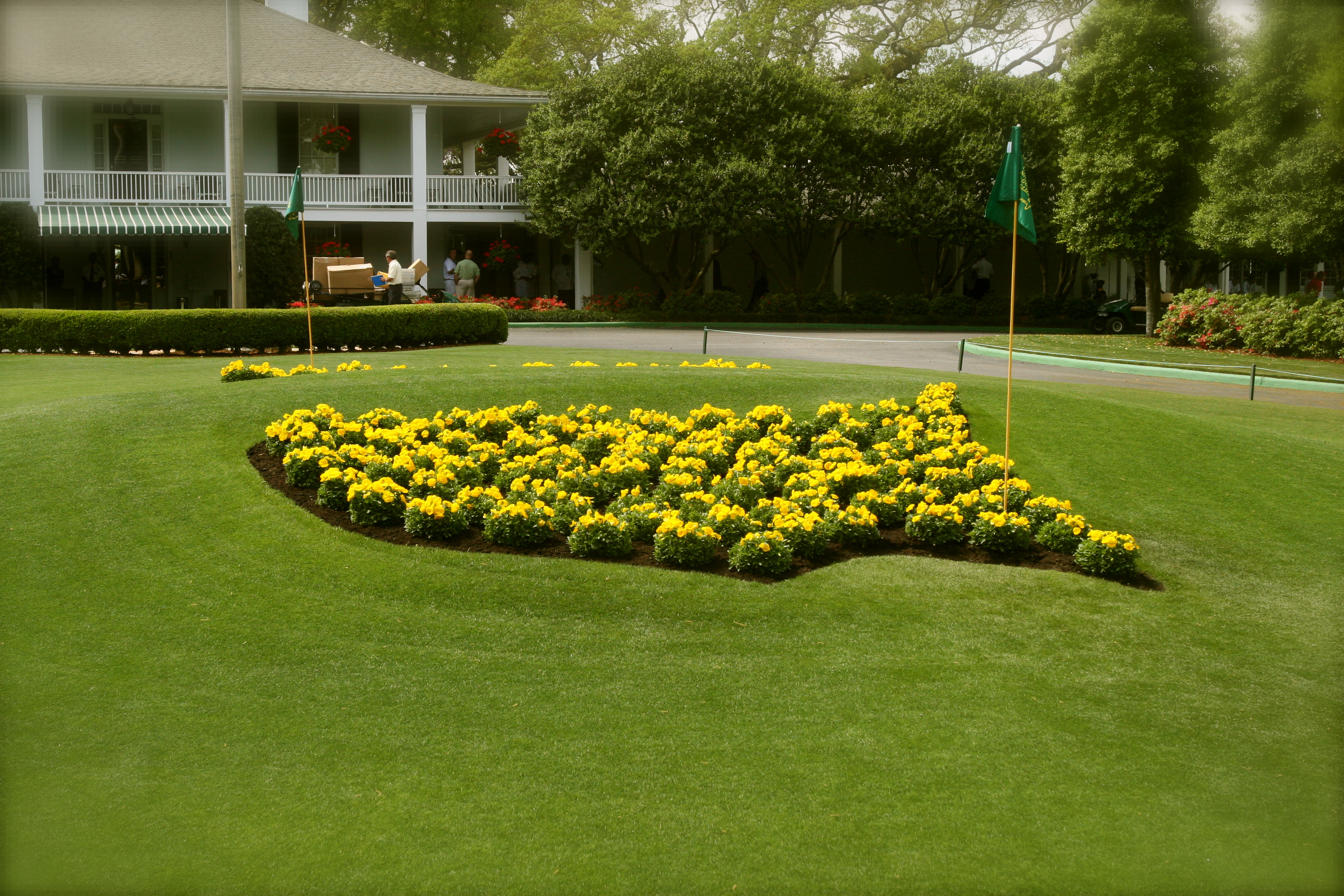
Masters Logo
With it being Masters week, I thought I would analyze the Masters Logo. By now, it is very noticeable to just about anyone, golf fan or not. The logo itself symbolizes more than just the tournament but one of the premier tournaments in the world. The bright colors that are portrayed in the logo seem to symbolize the bright and vibrant sights at Augusta National in early April. Making the US a bright yellow also helps emphasize the flagstick that is a vital part of the logo. The flag comes down to a hole the is strategically placed at Augusta, Georgia. The host town of The Masters. The logo does not only symbolize The Masters, but also Augusta National Golf Club. Both very prestigious and the logo is nothing but that as well. 

AntiSmoking Picture
http://images.search.yahoo.com/images/view;_ylt=A0PDoTAUsnlPN1YAnu6JzbkF;_ylu=X3oDMTBlMTQ4cGxyBHNlYwNzcgRzbGsDaW1n?back=http%3A%2F%2Fimages.search.yahoo.com%2Fsearch%2Fimages%3Fp%3Dtobacco%26ei%3DUTF-8%26fr%3Dyfp-t-701%26tab%3Dorganic%26ri%3D17&w=1476&h=1768&imgurl=www.hypnosisaddictions.com%2Fskeleton_with_smoke_edited-4.jpg&rurl=http%3A%2F%2Fwww.hypnosisaddictions.com%2FTOBACCO.html&size=77.3+KB&name=LifeStyle+by+Choice-TOBACCO&p=tobacco&oid=4ae84016dd9804e09232b41068f2a3a8&fr2=&fr=yfp-t-701&tt=LifeStyle%2Bby%2BChoice-TOBACCO&b=0&ni=144&no=17&tab=organic&ts=&sigr=11eqvudn2&sigb=12umejt46&sigi=11rfir05m&.crumb=45kSavNq9Pg
The purpose of the picture is to scare people away from smoking. The contents in the picture are a skeleton smoking a cigarette, which communicates the fact that people die from smoking. If you also look at the skeleton's teeth, you'll see that some are missing, which communicates the fact that smoking can rot your teeth out. The skeleton is something that people find unapealing(nobody wants to be a skeleton)
The purpose of the picture is to scare people away from smoking. The contents in the picture are a skeleton smoking a cigarette, which communicates the fact that people die from smoking. If you also look at the skeleton's teeth, you'll see that some are missing, which communicates the fact that smoking can rot your teeth out. The skeleton is something that people find unapealing(nobody wants to be a skeleton)
Interesting Image
Interesting Image
In this image by the Milwaukee Public Library, the reader is supposed to initially see the Blue box with white text within and think, "Hey I know that". Images/color patterns/logos are as informative as actual words once tehy are widely known, and facebook is no exception. Example In case you're unfamiliar with facebook. While the image itself has no real image, the logo is so widely known even if the text were to say something other than facebook, the initial gut reaction is to associate it with facebook just because of the color and text shapes. The words are obviously trying to make a pun about how people should be reading more. It's a very affective, very simplistic image that piggybacks the fame of a very popular website to elicit a response in the audience. More and more advertisements use this strategy as it's a very effective and easy method so long as no lawsuits are brought up.
In this image by the Milwaukee Public Library, the reader is supposed to initially see the Blue box with white text within and think, "Hey I know that". Images/color patterns/logos are as informative as actual words once tehy are widely known, and facebook is no exception. Example In case you're unfamiliar with facebook. While the image itself has no real image, the logo is so widely known even if the text were to say something other than facebook, the initial gut reaction is to associate it with facebook just because of the color and text shapes. The words are obviously trying to make a pun about how people should be reading more. It's a very affective, very simplistic image that piggybacks the fame of a very popular website to elicit a response in the audience. More and more advertisements use this strategy as it's a very effective and easy method so long as no lawsuits are brought up.
Visual Communication

This is an ad trying to protect the enviroment and the rainforests. They are saying if we do not protect our rainforests, then gobal warming will keep ruining mother nature and eventually our world will be underwater. They are showing us the consequences of us destroying rainforests. The words and pictures work together because they enhance the message of the advertisment and make the goal and meaning clearer. The fact that they put an image of New York City in the pool and underwater says alot because New York City is such a powerful city in the world.
Visual Element
The advertisement is trying to portray the downside to alcohol abuse. The visual element contributes to the message by depicting negative effects of alcohol.
The advertisement invovles both words and a visual image. The picture is the main focus which draws the audience in. The words are placed on the woman's head which makes it the next part of the advetisement that the audience will pay attention to.
The design choices made for the advertisement are primarily meant to be unappealing. This is because the point of the image is to make drinking alcohol something that is undesirable. The woman has the back of her head showing, making her faced away. The colors are for the post part pretty dismal. The woman is in all black, the floor is blue and shady, and the words and toilet are in white.
http://www.google.com/imgres?hl=en&gbv=2&biw=1280&bih=843&tbm=isch&tbnid=e5oVxhcvH8RntM:&imgrefurl=http://ingenial.com/45&docid=OWiKLT8dt_s6oM&imgurl=http://adage.com/images/bin/image/photo/binge030310.jpg%253F1267659192&w=180&h=256&ei=W7J5T5WMFuHc0QHm5Zy_DQ&zoom=1&iact=hc&vpx=415&vpy=151&dur=577&hovh=204&hovw=144&tx=101&ty=120&sig=116759862393475572435&page=1&tbnh=151&tbnw=106&start=0&ndsp=25&ved=1t:429,r:1,s:0

It's trying to say that the Boston Celtics big 3 are old and not good anymore regarding Kevin Garnett, Ray Allen, and Paul Pierce.
The worlds just really tell the picture and it gives you the concept of the picture because if no words were used then we wouldn't know why a old woman was sitting in class.
The college students in the background looking confused and talking doing many different things.
Running on Empty, or not!

Found this interesting because the woman in handicapped, but not really. She has done a marathon and a triathlon, and now, provides assistance in designing prosthetic limbs.
the background is peaceful and vacant, with her counter-posed to that as active, working hard at her training, and living beyond the expectations of her perceivable limitations.
This is from the site is Wired.
The article tells about her work on developing better running equipment for people like herself, drawing on the experiences gained in that mode:
Flex-Run foot to provide a more natural stride. They extended the carbon fiber blade at the toe and tweaked the signature C-shape to improve forward energy return and smooth the roll-over on each stride. Most notably, they added a removable sole, created by Nike, that fits snugly around the base and secures with plastic tabs.
The technology discussion reflects how far we have come in providing outlets for people born without limbs to be as normal, and extraordinary people in life.
The Wired site is appealing because plenty of white space is dedicated to opening up the space. You feel at home, welcomed into the technology-laden articles they present.
http://www.google.com/imgres?um=1&hl=en&rls=com.microsoft:en-us:IE-SearchBox&biw=1366&bih=557&tbm=isch&tbnid=ZE6A5OTEGyQaSM:&imgrefurl=http://www.businesspundit.com/the-unique-origins-of-25-popular-products/&docid=9NE60Zmw1EeC9M&imgurl=http://www.businesspundit.com/wp-content/uploads/2009/09/zzgatorade.jpg&w=425&h=441&ei=gbJ5T8iRNuS20AGL8_C9DQ&zoom=1&iact=hc&vpx=504&vpy=2&dur=6712&hovh=229&hovw=220&tx=118&ty=53&sig=112783908998267108374&page=1&tbnh=116&tbnw=85&start=0&ndsp=25&ved=1t:429,r:11,s:0
Above is a link to a picture for a Gatorade advertisement.
It shows an athletic woman drinking Gatorade.
She is portrayed to be sweaty and tired and in need of something to replenish her.
The look on her face while drinking the Gatorade is made so it looks like she is enjoying the Gatorade more than anything else at that moment.
they have the Gatorade pointed toward the camera so you can see the label.
The picture is trying to say that Gatorade is refreshing and thirst quenching and they aim there sales towards athletes so they use her facial expression with the combination of her sweaty and in workout clothes to show how athletes would enjoy this drink.
1. The image is of a little girl blowing bubbles, but the bubbles are amoke. The message is that if you smoke, then your children are smoking too.
2. The words reinforce the obvious message portrayed by the picture which makes the message that much stronger. By using them both together they compliment one another and deliver a clear message.
3. I thought the photo was appealing in that it was sending a direct and true statement and did so in an effective manner. By a chld blowing bubbles but really blowing smoke, it shows the child's innocence.
Subscribe to:
Comments (Atom)